- Events & Programs Home
- Calendar
- Accessibility
- Adults
-
Families & Teens
- Families & Teens Home
- 10x10 Teen Art Expo
- Art on the Rise
- Art Together: Art Making for Families with Children Ages 3–5
- Babies Sing with May Festival Minis
- Boy Scouts / Girl Scouts
- CAM Kids Day
- Family Storytime and Gallery Walk
- Family Studio: Art Making for Families with Children Ages 6–12
- Games in the Galleries
- Members-Only Baby Tours
- Public Baby Tours
- REC Reads
- Rosenthal Education Center (REC)
- Saturday Morning Art Class
- See Play Learn Kits
- Summer Camp
- Teen Fest: Zine and Comic Exchange
- RECreate
- Teen Immersive Workshop: Portraiture
- Teachers
- Community Outreach
- Fundraisers
- Plan Your Own Event
Blog: CAM Uncovered
Blog: CAM Uncovered
- Home
- Plan Your Visit
- Art
-
Events & Programs
- Events & Programs Home
- Calendar
- Accessibility
- Adults
-
Families & Teens
- Families & Teens Home
- 10x10 Teen Art Expo
- Art on the Rise
- Art Together: Art Making for Families with Children Ages 3–5
- Babies Sing with May Festival Minis
- Boy Scouts / Girl Scouts
- CAM Kids Day
- Family Storytime and Gallery Walk
- Family Studio: Art Making for Families with Children Ages 6–12
- Games in the Galleries
- Members-Only Baby Tours
- Public Baby Tours
- REC Reads
- Rosenthal Education Center (REC)
- Saturday Morning Art Class
- See Play Learn Kits
- Summer Camp
- Teen Fest: Zine and Comic Exchange
- RECreate
- Teen Immersive Workshop: Portraiture
- Teachers
- Community Outreach
- Fundraisers
- Plan Your Own Event
- Give & Join
- About
- Tickets
- Calendar
- Exhibitions
- Collections
- Blog
- Shop
Behind the Scenes in Conservation: More than Just a Print
by by Cecile Mear, Conservator of Works on Paper
4/5/2024
CAMConservation , paper conservation , Lesley Dill , prints , Tandem Press
Two prints by Lesley Dill featured in the recent post by Curator of Prints Kristin Spangenberg are now on view in Gallery 150. While preparing the prints for framing, I had the opportunity to examine them closely and photograph details that reveal the artist’s creative use of materials. The publisher, Tandem Press at the University of Wisconsin-Madison, provided detailed documentation about how the prints were produced. Without this information it would be difficult to accurately identify the techniques and materials of each print. The artist presented her design to the press and collaborated with three master printers to select papers, ink colors, and printing techniques.
In Lest the Blaze Should Torch my Hand: Heavenly Mother Ann Lee the master printers screen-printed leaves and roots onto Rives BFK paper. They then screen-printed and relief-printed the design onto Japanese Sekishu paper which was used to create the dress and banners. After completing the printing process, the printers again consulted with the artist on how to assemble the collage. The translucent quality of the Japanese paper allows the printed design below to show through. Though the paper appears delicate, it is sturdy enough to hold up under the pressure of printing and folding. The photos show the pleats that give the print a three-dimensional quality. The photos also show printed areas visible through the paper. The shimmery leaves and line at the bottom of the design are collaged colored silver leaf. Threads pierce the Rives paper at the top corners and hang down the sides.
Sojourner Truth: Orator, Abolitionist, Feminist is similarly complex. At first glance the work looks like a simple blue and white print, but Dill’s conception included a layered design constructed of three different types of paper. Arches 88 paper was relief-printed to form a solid layer of blue ink. Sekishu paper was screen-printed with dark lines. The printers then screen printed the white letters on Japanese gampi paper. What is most amazing to me about this print is that the blue figure was printed on kozo paper, cut out and collaged onto the gampi. With the three papers stacked, the dark lines on the Sekishu appear as shadows behind the top layer of gampi paper. The blue ink on the Arches paper slightly alters the appearance of the translucent Japanese papers. Threads stitched through the two layers of Japanese paper at the top corners hang down the sides of the print.
Neither of these prints is unique; the artists at Tandem Press created multiple impressions of each one. When you come to the museum to see these prints in person, take time to appreciate not just the messages they convey but also the amount of work that went into producing them.
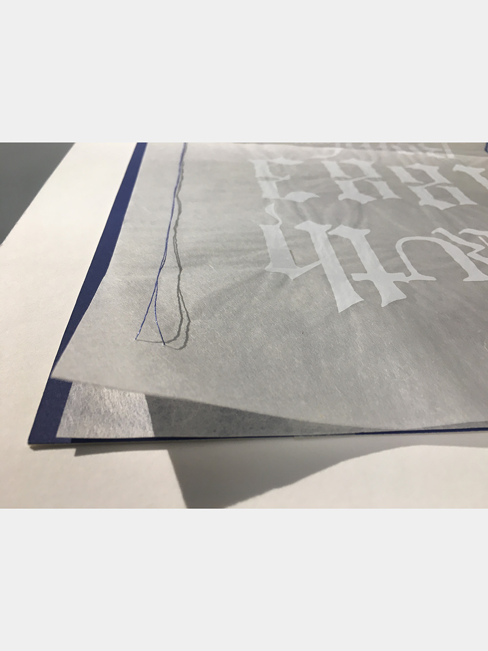
Lesley Dill (American, b. 1950), Sojourner Truth: Orator, Abolitionist, Feminist, 2022, color screen print, relief, and collage with thread printed at Tandem Press, University of Wisconsin-Madison, The Albert P. Strietmann Collection, 2023.22
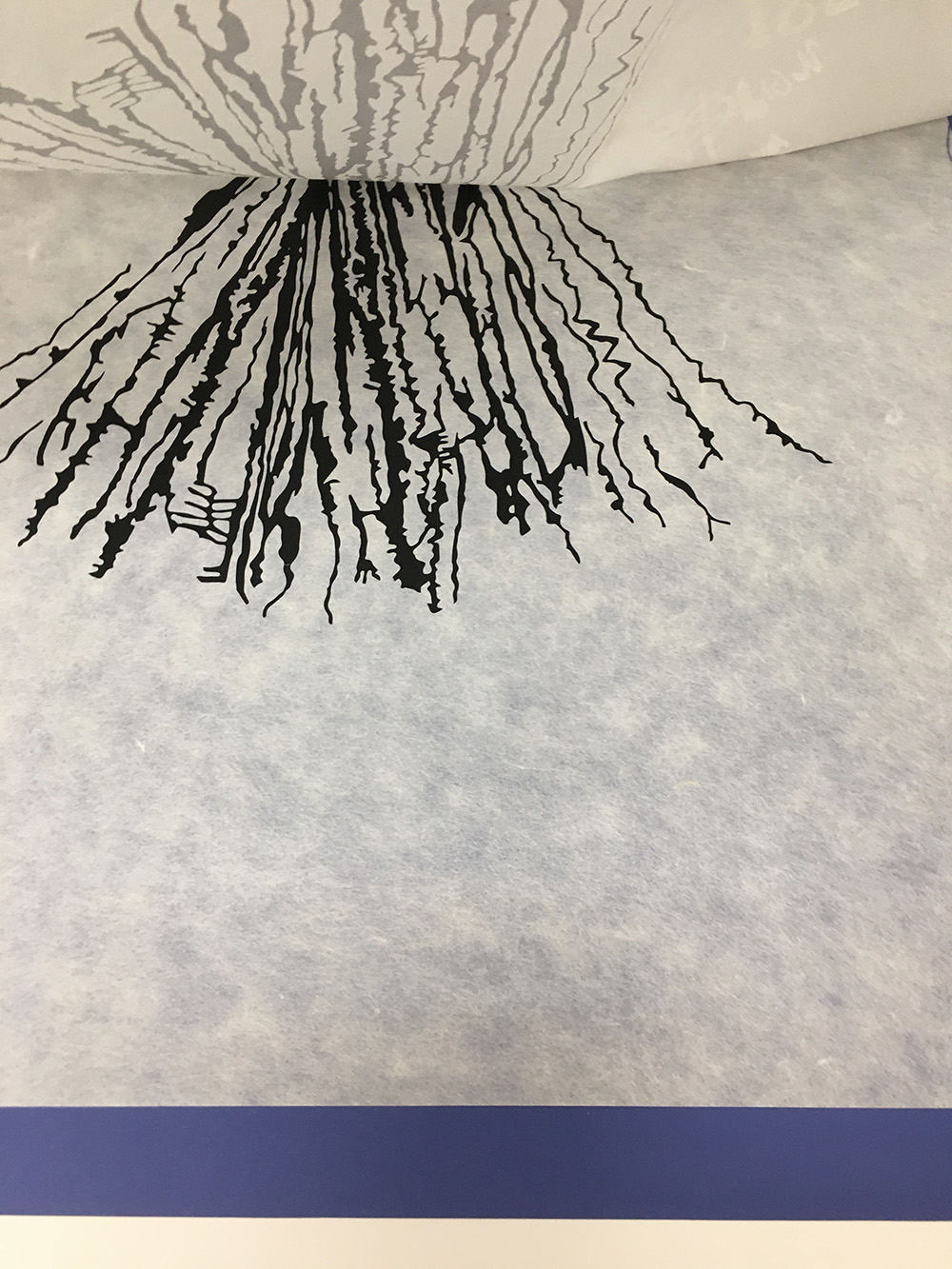
Lesley Dill (American, b. 1950), Sojourner Truth: Orator, Abolitionist, Feminist, 2022, color screen print, relief, and collage with thread printed at Tandem Press, University of Wisconsin-Madison, The Albert P. Strietmann Collection, 2023.22
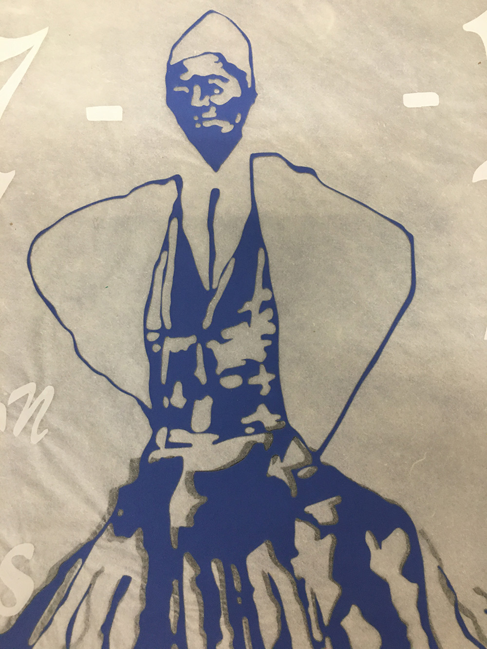
Lesley Dill (American, b. 1950), Sojourner Truth: Orator, Abolitionist, Feminist, 2022, color screen print, relief, and collage with thread printed at Tandem Press, University of Wisconsin-Madison, The Albert P. Strietmann Collection, 2023.22
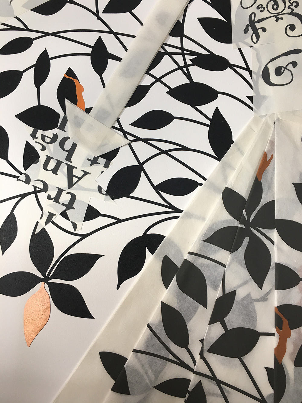
Lesley Dill (American, b. 1950), Lest the Blaze Should Torch my Hand: Heavenly Mother Ann Lee, 2022, color screen print, relief, and collage with colored silver leaf and thread printed at Tandem Press, University of Wisconsin-Madison, The Albert P. Strietmann Collection, 2023.23
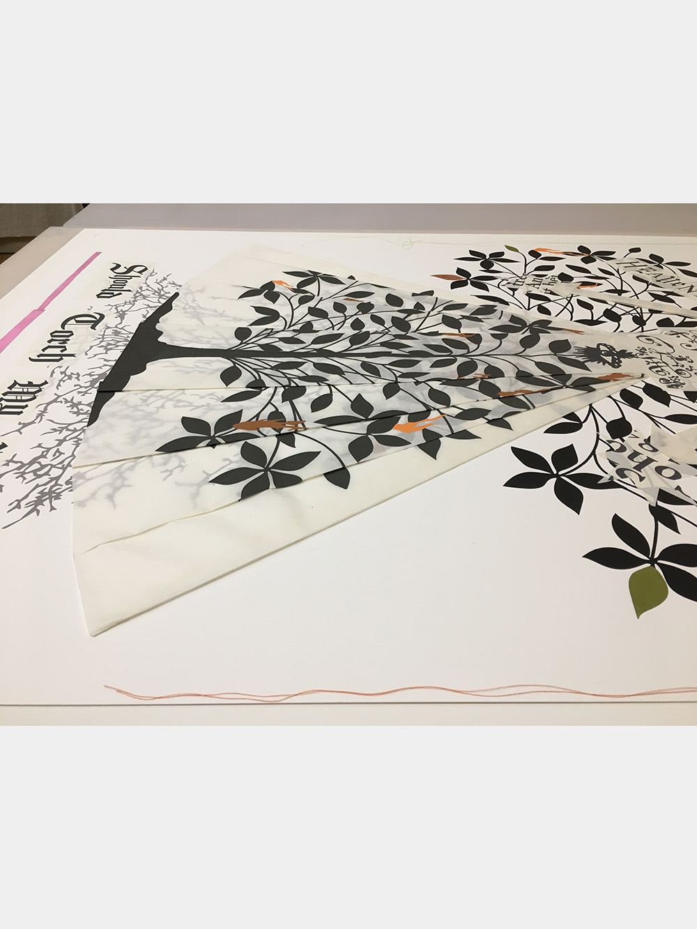
Lesley Dill (American, b. 1950), Lest the Blaze Should Torch my Hand: Heavenly Mother Ann Lee, 2022, color screen print, relief, and collage with colored silver leaf and thread printed at Tandem Press, University of Wisconsin-Madison, The Albert P. Strietmann Collection, 2023.23
Related Blog Posts
Cincinnati, OH 45202
Toll Free: 1 (877) 472-4226
Museum Hours
Museum Shop
Terrace Café
Library
Cincinnati Art Museum is supported by the tens of thousands of people who give generously to the annual ArtsWave Campaign, the region's primary source for arts funding.

Free general admission to the Cincinnati Art Museum is made possible by a gift from the Rosenthal Family Foundation. Exhibition pricing may vary. Parking at the Cincinnati Art Museum is free.
Generous support for our extended Thursday hours is provided by Art Bridges Foundation’s Access for All program.

General operating support provided by:


