
Picasso Landscapes: Out of Bounds—The Design of the Exhibition
by Franck Mercurio, Publications Editor
7/26/2023
When we think of spaces where modern art is exhibited, the minimalist aesthetic of white-walled galleries often comes to mind. But in Picasso Landscapes: Out of Bounds, CAM’s exhibition designers imagined—and created—a much different kind of experience.
Art historians recognize Pablo Picasso (1881–1973) as a ground-breaking artist, who helped usher in the age of modern art during the early twentieth century. But as a young man, Picasso trained in traditional art academies, where artists learned to create the illusion of space in landscape painting through the structures of foreground, middle ground, and background—leading the viewer into and through a composition. This technique of layering planar elements, one in front of the other, became more accentuated—and abstracted—in Picasso’s modernist works, including his Cubist paintings and his set designs for the Ballets Russes.
CAM’s designers used these artistic cues to translate Picasso’s 2D concepts into 3D exhibition spaces.

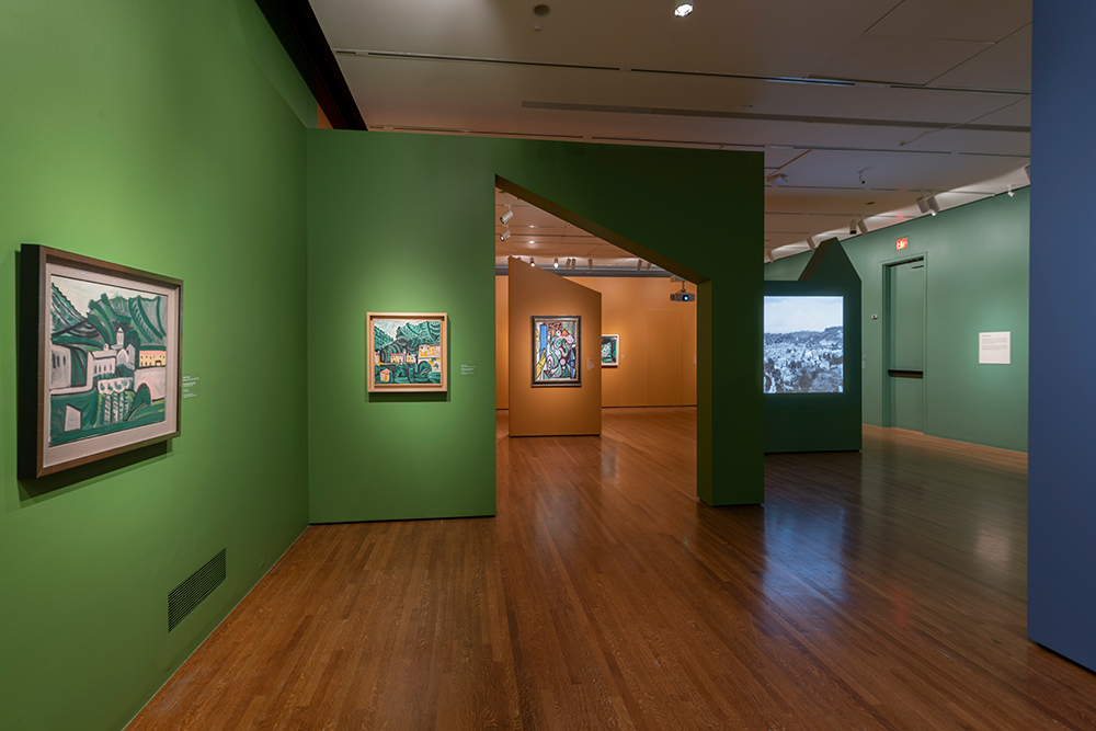

“We created a series of spaces defined by free-standing walls of different profiles, inspired by forms in Picasso’s paintings,” says Lauren Walker, the museum’s Head of Exhibition Design.
Many of the walls are not connected where you might expect them to be. Instead of hard corners in some areas of the exhibition, the designers placed narrow gaps, allowing for “peek-through” moments.
“The sightlines between walls give visitors views into adjoining spaces,” explains Lauren. “They give a more dynamic feel to the show.”
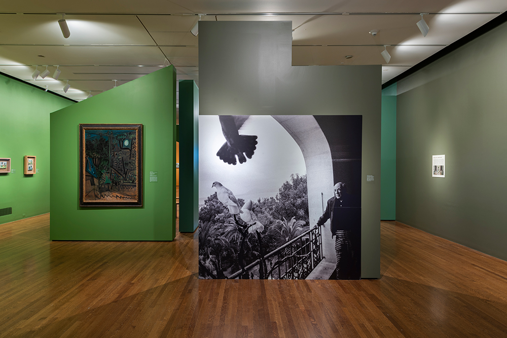
Visitors to Picasso Landscapes travel a chronological path through the exhibition. Peter Bell, Curator of European Paintings, Sculpture & Drawings, helped define this narrative format, into which CAM’s designers incorporated elements that transport visitors into the historical context of Picasso’s life. Large-scale video projections feature vintage films and set the scene within each gallery, and maps show where Picasso lived and worked during different periods of his long artistic career.
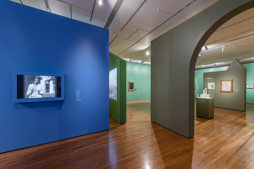
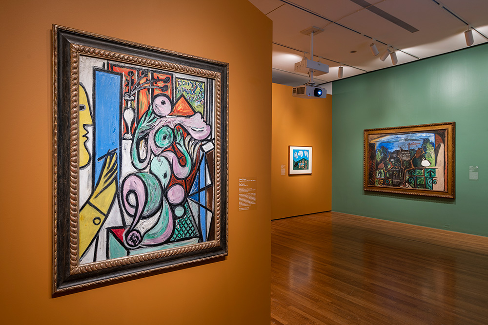
Drawing from the colors found in Picasso’s paintings, Lauren and her team created a palette for the exhibition’s walls and graphic panels that harmonize with the art on display. The effect brings the artwork into full focus, while creating the illusion of being immersed within the artist’s painted landscapes.
CAM’s graphic design team chose Helvetica as the exhibition’s main typeface. This classic, sans serif font—used throughout on object labels and wall panels—harmonizes with the show’s overall design without distracting from the exhibited artworks.
“The typeface and other graphic elements are designed to complement—but not overshadow—the works on display,” explains Lauren.
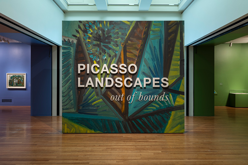
Placed at the entry to Picasso Landscapes, the title wall is a tour-de-force of the exhibition’s design. CAM’s graphic designers enlarged a detail of the artist’s The Vert-Galant (1943) to encompass the wall, as a background graphic for the exhibition’s title, highlighting the painting’s impasto and canvas texture, supersized. The wall’s vibrant colors serve as a prelude to the art displayed within the show, as well as a bold introduction, welcoming visitors into the exhibition.
Picasso Landscapes: Out of Bounds is on view through October 15—come see it!
Cincinnati, OH 45202
Toll Free: 1 (877) 472-4226
Museum Hours
Museum Shop
Terrace Café
Library
Cincinnati Art Museum is supported by the tens of thousands of people who give generously to the annual ArtsWave Campaign, the region's primary source for arts funding.
![]()
Free general admission to the Cincinnati Art Museum is made possible by a gift from the Rosenthal Family Foundation. Exhibition pricing may vary. Parking at the Cincinnati Art Museum is free.
Generous support for our extended Thursday hours is provided by Art Bridges Foundation’s Access for All program.
![]()
General operating support provided by:

![]()